National Geopolitics, 2008
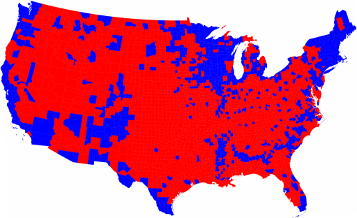
In searching for the 2008 electoral map, I ran into this blogger who posted up the 2004 map, proclaimed it the 2008 map, and then proclaimed that, in effect, areas of sparse population vote Republican and areas of dense population vote Democratic — which is as true when Bush wins by three percentage points as when Obama wins by seven, this is a Republican “Center Right” Country. There might be many reasons to support the case of a “conservative nation” — certainly the authors of this book tell us this nation’s liberals are more conservative than some European nation’s liberals, but the great Republican Electoral Landmass Victory Argument which came into vogue after the 2000 election has always struck me as just plain bizarre. To be fair to that misguided politically myopic blogger, the maps for the years of 2008, 2004, and 2000 on the county level look much the same, though 2004 and 2000 are more alike, as 2008 does show decipherable changes. (I would have to study the 2000 and 2004 maps more than I am willing to in order to spot any difference, and that was my observation when looking at the two after the 2004 election.)Â
I guess this runs back to the Oregonian editor about brewing rural anger I posted over here (after commenting on the threat of the great bogey Socialism seen in thoughts about high school sports programs).
But a few maps for which to understand the shift for the 2008 election. One, I frist saw at the New York Times site and having to fish it around first see at dailykos:
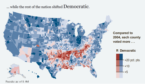
Or… the bane of Obama’s existence, as it turned out, really was… Appalachia, and into the Okies… which was where he lost late primary elections by 40 plus points in Kentucky and West Virginia and where primary elections in Pennsylvania and Ohio were eaten away.  I have seen commenters suggest that this map is misleading for this or that reason, and maybe it is if you extrapulate it too far with too much meaning — but take it at its most narrow meaning, and you see what, with a national 10 point swing in poll results, switched more Republican and what switched more Democratic — and decipher what you can from demographics and sociographics from that. Correlate it to this map, which showed itself in the narrow campaign slogan of McCain as “The American President Americans have been Waiting for”, the meme which had put out there by a cover story in The Atlantic magazine a few months back.
But what I want to know is the relation between the red line of this “McCain Belt” with the (ahem) “Black Belt” . This commenter suggests it basically sits just atop it, so this stretch of land is hemmed in from The North to the, um, North and from a population of blacks to the South. The Black Belt is pretty easily spotted when looking at the county-by-county map for any of these years, and look for it in the Southeast corner of the map in the 2008 map. (unfortunately the county lines have been dropped, which is what I would prefer with this):
Maybe there are other things going on with this electoral map which someone else can spot in comparing the maps– you see Hispanics pushing certain parts of the Southwest further north, or a semi-dramtic shift in voting preferences on this demagraphic’s part — and, really, what is that new splotch of blue land in Eastern Washington all about? Well, figure it out for yourself.